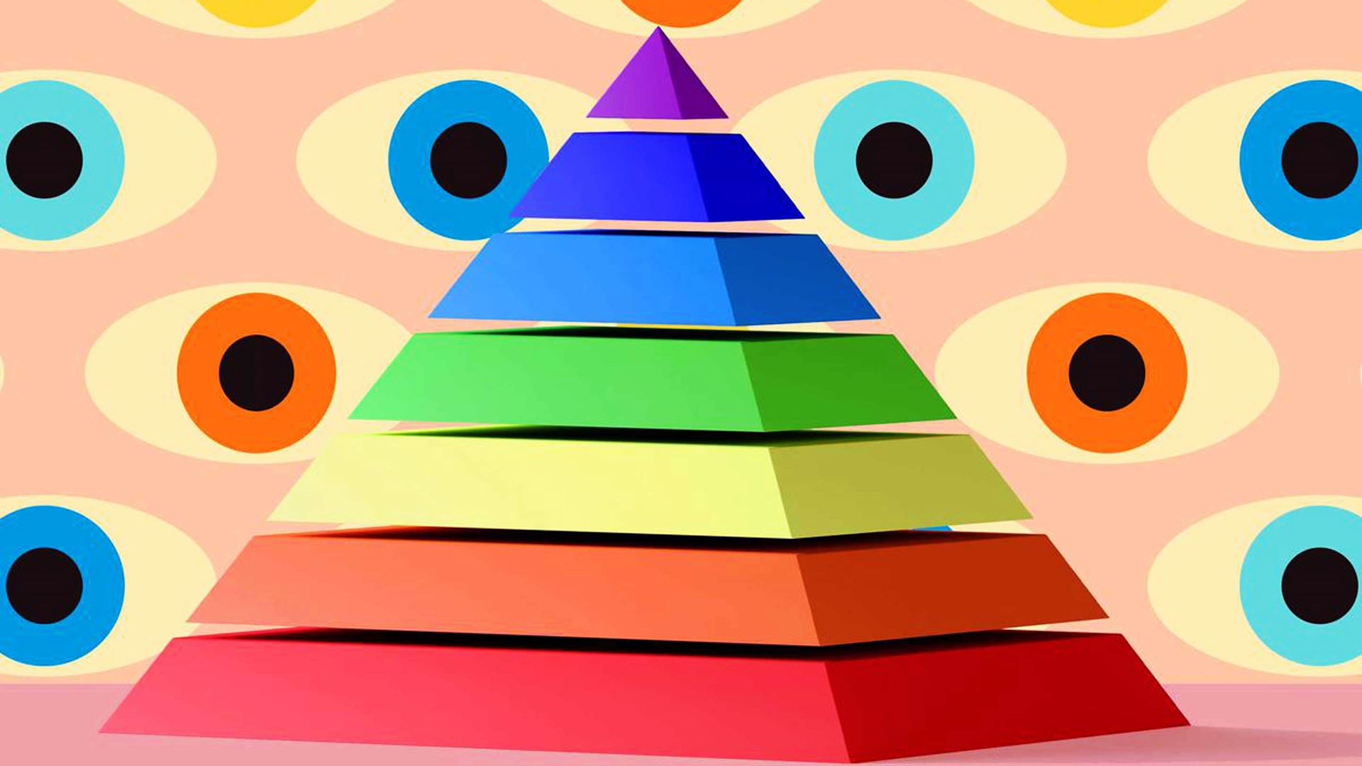
Think of visual hierarchy like the flow of a great story. You don’t start reading at the middle or the end—you begin at the top, where the most important details are, and let your curiosity guide you through the rest. In the world of design, visual hierarchy works the same way. It helps organize information in a way that’s easy to follow and understand. Ever noticed how the biggest text always catches your eye first, or how a bright button seems to almost “invite” you to click it? These are examples of how visual hierarchy shapes our experience.
The Cognitive Science of Visual Hierarchy
Before we dive into how to use visual hierarchy, let’s understand why it works the way it does. Our brains are hardwired to process visual information quickly and efficiently. This is because, as humans, we’ve evolved to make rapid decisions based on what we see in our environment. Whether it’s noticing the flash of a dangerous animal in the distance or recognizing a safe path to walk down, we need to process visual cues in a split second.
In design, this instinctual behavior is a key part of how visual hierarchy comes into play. Certain elements catch our attention naturally because of how our brains are wired. For example, when we see something large or brightly colored, our brain automatically identifies it as important. Similarly, if something is placed in a prominent spot, like the top of a page or center of a screen, we’re more likely to focus on it first.
In short, visual hierarchy works because it takes advantage of how we process visual information in our brains. Designers can use this knowledge to create layouts that feel natural and easy to follow.

Core Components of Visual Hierarchy
Now that we understand the psychology behind it, let’s break down the core components of visual hierarchy. These are the design elements that influence how we perceive and prioritize information. There are several factors at play, each one helping to guide our eyes and direct our attention.
Size and Scale
Have you ever noticed that the largest element on a page tends to grab your attention first? This is because our brains associate size with importance. Larger items naturally stand out more, making them the first thing we notice. It’s the same principle used in advertising—big, bold headlines are designed to catch your eye.
Imagine walking into a room with two chairs. One is giant and the other is tiny. Which one are you more likely to sit in? Of course, it’s the bigger one. The same idea applies to design. When you make something larger, you’re saying, “Hey, this is important, look at me first.”
Color and Contrast
Color has a powerful psychological effect on us. It can evoke emotions, convey messages, and guide attention. Bright colors, for example, are more likely to grab attention than muted tones. This is why red buttons or call-to-action elements on websites are often in bright, contrasting colors—they stand out and demand action.
Contrast also plays a key role. When something contrasts sharply with its surroundings, like black text on a white background, it becomes easier to read and immediately catches our attention. High contrast can draw the eye directly to specific areas, signaling that they are significant.

Typography and Readability
Typography is more than just choosing a pretty font. The style, weight, and size of your text can significantly impact how information is prioritized. For instance, larger fonts are often used for headlines, making them the first thing we notice when we look at a page. Similarly, bold text can draw attention to important points, while italics or light font weights are used for emphasis.
Consider this example: A newspaper headline is typically larger, bolder, and more eye-catching than the body text below it. This is because the headline is meant to grab your attention and convey the most important message. The body text, on the other hand, is smaller and lighter, indicating it’s there to support the main story, not take center stage.
Visual Weight and Depth
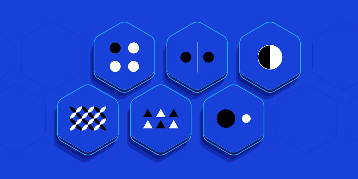
Not all elements in a design are equally “heavy.” Some things have a greater visual weight, meaning they stand out more due to their appearance. For example, dark, bold, and textured objects have more visual weight than light, soft, or transparent ones. This is why you often see darker, more solid buttons or icons—they’re designed to stand out and catch the viewer’s eye.
Similarly, depth can also affect how we perceive elements. Shadows, gradients, and 3D effects create a sense of depth that helps differentiate elements from the background. This can make certain components of a design appear closer or more important.


 Shirley combines her love for photography and design to curate a blog that inspires creativity in every frame. From event planning ideas to capturing candid moments, she covers it all. Shirley’s artistic vision encourages her readers to find and celebrate beauty in both everyday and extraordinary occasions.